JoomConnect Blog
MSP Marketing: 3 Types of Landing Pages That Your MSP Should Be Using
An important part of your website and your MSP marketing strategy are landing pages. However, a lot of small businesses don’t understand how to effectively use them. In this blog, we’ll cover the general components of an effective landing page, and ways that your MSP should be using them.
General Components of An Effective Landing Page
Before we talk about three types of landing pages you should be using, we should go over some general best practices across the board, regardless of the type of landing page you’re putting together:
- Limited Navigation - You want to ensure that those directed to your landing page are focused on what the landing page is presenting.
- Easy to Read - Landing pages shouldn’t be packed with too much information; that’s what a service page is for. Keep your explanations brief, use headings to split up content, and use listed items to make things easier to read.
- Visually Appealing - In addition to being easy to read, your landing page should be easy on the eyes too. Use images and video to create a more attractive page.
- Clear Call-To-Action - Whatever the ultimate goal of your landing page is, make it clear - and easy - for visitors to do exactly what you want them to do. Use language, headings, and buttons that centralize around this goal.
- Form with an Incentive - A successful landing page experience will end with the visitor filling out the form on your page. Your offer needs to be strong enough where they have an incentive to do this. Form length should also be short as to not discourage people from taking the time to fill it out.
Now, let’s get into what landing page types your MSP should be taking advantage of by explaining why this is valuable, and showing you an example that fits the best practices that we just covered above.
Landing Page Types
Landing Pages for Deliverables
Do you have a particularly valuable deliverable that you don’t want to give away for free to just anyone? Give it its own landing page!
Any whitepaper that your MSP has should have its own landing page. You might have some other deliverables that you’ve put together over the years that you want to require a prospect to submit their contact information in order to download. That’s fine too! Just keep in mind that you shouldn’t be doing this for EVERY deliverable.
Below is an example of an effective deliverable landing page. This one's for our VoIP whitepaper.
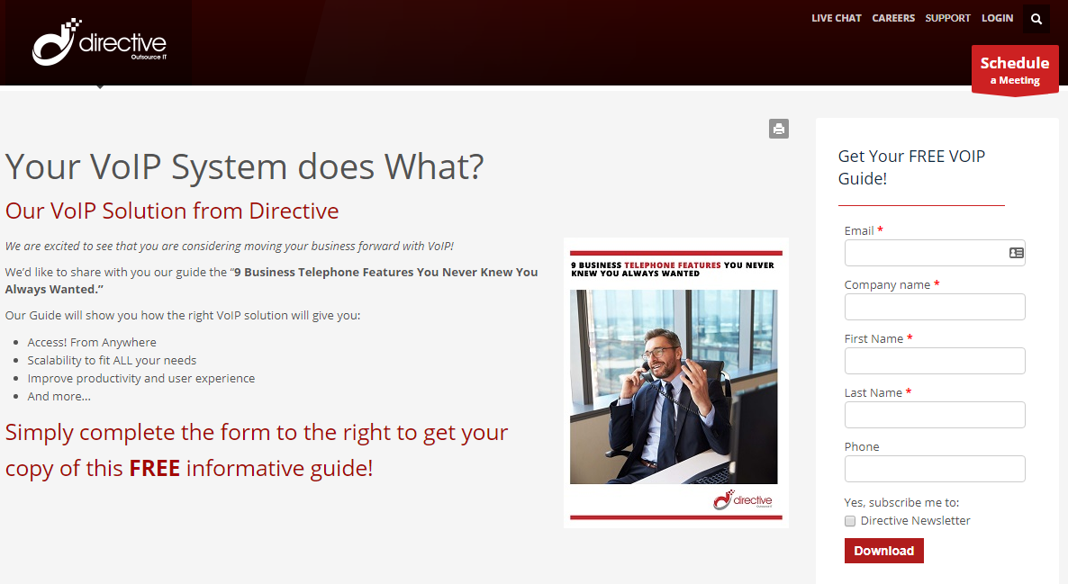
As you can see, there is limited navigation because there is no menu - only a logo and some basic functions. We want page visitors to be focused on what is on the page. The page itself is easy to read because there are multiple headings used, multiple colors, and bullets to describe listed items instead of a long paragraph.
The page has a call-to-action to do what we want them to do - fill out our form, which allows us to collect their contact information. There is an incentive for people to fill out the form - they get a free deliverable if they do! There is a visual on the page that previews the front cover of what they’re going to be getting. And finally, the form to collect their information isn’t too overbearing for them to fill out, but still allows us to collect the information that we want.
Landing Pages for Service Promotions
For a lot of your MSP marketing campaigns, you have the potential to achieve a greater return on your investment if you send recipients of your marketing materials to a landing page instead of a service page.
Here’s an example of an effective service promotion landing page. This one in particular is one that we used to promote our IT services during a billboard campaign that we ran.
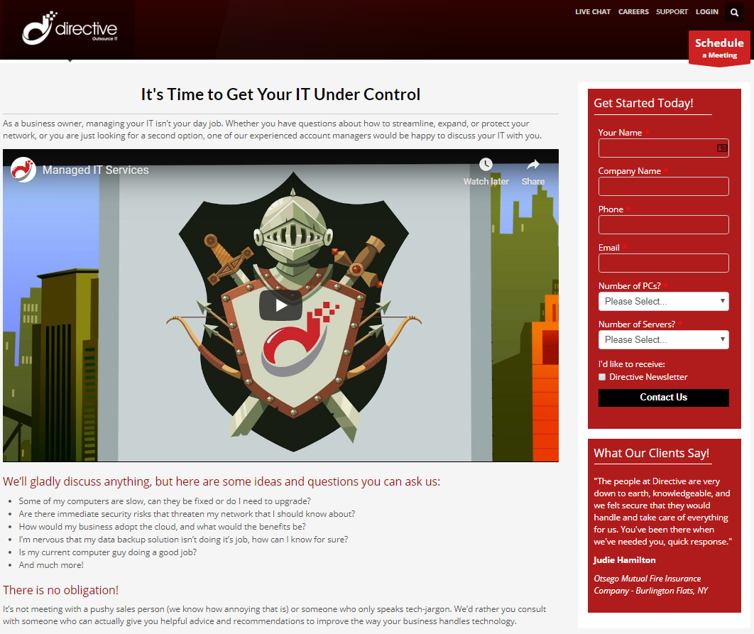
Like the previous landing page type, there is limited navigation - a characteristic seen on a majority of landing pages. It is also pretty easy to read due to color and formatting choices on the page. You’ll see a call-to-action toward the bottom of the page.
The page also contains an animated video that simplifies the concept of managed services - one of our MSP Marketing Videos. Not everyone knows the benefits of managed services - some people don’t even know what it is! A short video like this increases both engagement and clarity.
In the bottom right of the page, you’ll see a testimonial. After understanding what managed services is, visitors to your page might want to know how good you are at providing IT services to your clientele. Social proof is a great way to show this, and can give many prospects the extra push that they might need before converting.
Finally, there is a short form on the page for them to fill out. You’ll see this form has an opt-in checkbox right before the button to submit it so that the person filling it out can subscribe to receive our newsletter without having to fill out an additional form to do so. This allows us to hit this individual with additional marketing touches.
Landing Pages for Sign-Ups
Whether you have a live event you are hosting that you would like people to register for or some other sort of sign-up form, landing pages are great when you’re trying to limit the amount of people signing up to a specific time period or a specific marketing campaign.
Here’s an example of an effective sign-up landing page. This one is for a 90 day trial for our IT services.
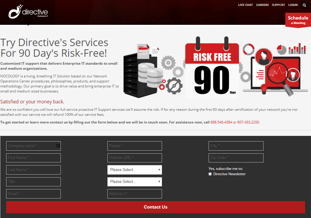
Again, this type of page hits the three main characteristics of a landing page: limited navigation, easy to read, and has a call-to-action to do what we want - which is to sign up for a free trial by filling out the form on the page. The page itself is easy to read because there are multiple headings used, multiple colors, and bullets to describe listed items instead of a long paragraph. Visitors have an incentive to fill out this form, and the page itself uses language to emphasize this such as the words “risk-free”. There is a graphic on the page that matches branding and is visually appealing. And finally, the form to collect their information.
You’ll notice that this form is laid out differently than the other forms you’ve seen. This is because it needs to collect a bit more information than the previous two forms needed to. Because of this, it wouldn’t make as much sense to put it on the right hand size of the page - landing pages have less content than service pages do, and the form would extend the page to be much longer than it needs to be. This design keeps the page clean and visually attractive without overwhelming the person who visits it.
Get Started Using Landing Pages to Drive Conversions!
There are plenty of other ways to utilize landing pages outside of the ones we’ve discussed - we’ve only scratched the surface. If you’d like some assistance putting some together, you can lean on JoomConnect and our expert web designers to give you a page that will capture the attention of those who visit it.
Already have landing pages but need help driving traffic to them? We can help with that too! Give us a call at 888-546-4384 and we can discuss putting together a custom MSP marketing campaign to suit your needs.
About the author
![]()

Blog Categories
Grab this article

Comments