JoomConnect Blog
Is Your Marketing Mobile-Friendly?

The world is changing rapidly. Business decision makers can access information about your company like never before. It’s likely that not every decision maker is sitting at their desk at work, researching you from the comfort of their desktop computer. They may be at home, sitting on their couch, doing that research from their smartphone or tablet.
It’s the same with your current clientele. When they receive promotional emails from you, receive content that directs them to a landing page on your website, or are scrolling through your social media feeds, they may be doing so through a mobile device. It’s often much more convenient for them to do so, after all.
Are you prepared for that?
Many businesses aren’t. As a result, the marketing materials those business put out online render poorly on a mobile device. And, especially as an MSP, that won’t reflect well on your company’s expertise.
As you can see, having content that is mobile-friendly is more important than you think. Here are some statistics to further drive that message home:
- 57% of online traffic in the US now comes from smartphones and tablets
- 51% of customers say they use mobile devices to discover new brands and products
- Over 60% of B2B buyers report that mobile played a significant role in a recent purchase
- 89% of people are likely to recommend a brand after a positive brand experience on mobile
Don’t worry, you don’t have to create a whole new marketing strategy to reach those accessing your marketing materials from a mobile device. If you can incorporate mobile-friendly practices into your current strategy, you should be okay. Here are some places to start.
Mobile-Friendly Company Website
Your website is the backbone of your company - it’s one of the biggest marketing tools that you have. In today’s world, it’s pretty much a guarantee that every business decision maker will visit a company’s website somewhere in their decision process.
In fact, not having a mobile-friendly website can be detrimental to your company:
- 57% of users won’t recommend a business with a poorly-designed mobile site
- 53% of mobile website visits are abandoned if a mobile site takes longer than three seconds to load
- For every one second delay in website load time on a mobile device, conversions fall by 12%
- 61% of users are unlikely to return to a mobile site they had trouble accessing, and 40% visit a competitor’s site instead
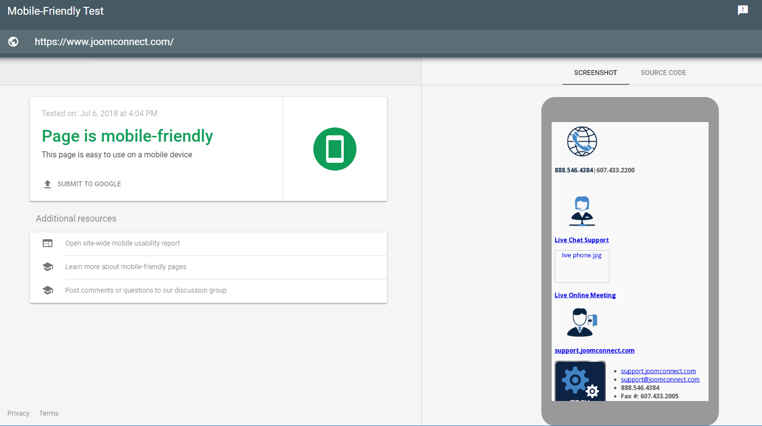
As you can see, it’s very important that your company’s website is optimized for any sized device. Google thinks it’s important too: they consider the mobile-friendliness of your website as a ranking signal. You can use Google’s Mobile-Friendly Test to see where your website stands as a starting point. If their test finds your website to not be mobile-friendly, here are some red flags that might be the cause:
- Speed: As you probably gathered from the statistics we presented to you, mobile device users prioritize speed when browsing a company’s website. If your content is loading slowly, you may need to have your web team fix that so you don’t lose mobile (or web) traffic.
- Sizing: Mobile website visitors should not have to scroll side-to-side and zoom in when trying to read text on your website. Ensure that all text is readable as well as properly spaced and resized for the device it is being viewed from.
- Missing content: If your website is not optimized properly, you may be missing menu items or buttons throughout your website. This may result in mobile-specific errors. At minimum, it gives mobile viewers less access to your website content, potentially causing them to miss out on important information that your website provides.
If you run across any of these, you might want to consider redesigning your website. There are various web design platforms that utilize mobile-responsive designs that you could use. Using one of these platforms will ensure that your website will look great and be functional on any size or type of device.
Mobile-Friendly Email Marketing
If you’re utilizing email in your marketing efforts (and, you should be), you should expect that at least some of the recipients of those emails will view that email from a mobile device. Here’s why you should be focused on providing a good experience for those people:
- 61% of US email opens in 2017 occurred on mobile compared to 15% on desktop and 24% in a webmail client
- 69% of mobile users delete emails that aren’t optimized for mobile
- 70% of recipients delete emails immediately that don’t render well on a mobile device
To ensure that your emails are mobile-friendly, you should be sending test emails to yourself until you have your text and design perfected. Here are some things to look for when in the testing phase.
- Text: Make sure that you don’t have to scroll left or right to read any text. The text should be legible so that the reader does not have to zoom in, and not too crowded. Your text should also be in a single column; multiple columns typically appear too condensed on a mobile device.
- Images: Images and other visual elements should be legible. They should be resizable for different devices. Make sure that the images are not too large - large images increase load times.
- Links: It should be easy for users to click on any links in your email, whether it be on text or on a button or image. In addition, make sure the page they are directed to is mobile-friendly. You should be clicking on each link in the email when testing to make sure that no errors reach the client.
If you are sending complex, image-heavy emails, it may be time to switch to an email marketing provider like MailChimp to help ensure that your content is formatted for optimal viewing on any device.
Mobile-Friendly Social Media Marketing
Like most businesses, you are probably on social media in some shape or form (whether or not your channels are active is another story). And, because 80% of social media time is spent on a mobile device, you can expect that every social media platform has optimized their mobile websites and applications for any sized device. While this may be true overall, there are still mistakes that you can make if you’re not careful.
Here are some things to keep in mind in regards to social media:
- Keep it short: When browsing social media from a mobile device, users don’t want to be confronted with a 500-word, 5-paragraph essay. They want a quick overview of what you are talking about. If you want to write that ‘essay,’ write a blog and linked to it from social media instead.
- Include visuals: Images and videos perform well in a mobile environment. In regards to images, make sure that any text on those images is still readable on a small, mobile screen.
- Limit your emojis: Yes, emojis are mobile-friendly. However, loading each of your messages with 5+ emojis isn’t necessarily that professional. It’s okay to throw in the occasional emoji for your ‘fun’ office or holiday posts. But, limit it to that. This is your business page, not your own personal profile.
Overall, you should be checking your business’ social media profiles on occasion from a mobile device to make sure everything looks okay.
Mobile Optimization Help
We can help you ensure that all of your online marketing efforts are optimized for any device. Contact us for help with website, email, or social media mobile optimization.
About the author

Blog Categories
Grab this article

Comments