JoomConnect Blog
Using Good Form When Creating Forms
When seeking out information about your web visitors and audience, your forms are one of your best, and most crucial, tools. Admittedly, this does rely on your audience filling out your forms, which you can make more likely through particular best practices and design choices. In this blog we’ll review a few of these practices and choices to optimize the effectiveness of your forms.
Amount
The first consideration you have to make is how many fields your form has for your audience to fill out. Generally, the “less is more” mentality is an important part of these considerations, as the longer your form is, the less likely your audience will stick around to fill out the entire thing - ultimately, defeating the purpose of the form.
You should consider how essential each field is at that time. If you don’t need a certain piece of information at that point in the marketing funnel, wait until a later point or further opportunity to collect it. In addition to eliminating certain pieces of information, you should try to consolidate your forms into fields that you can infer some data from based on their response. For one example, by collecting a new contact’s postal code, you can infer their state and often even their general area. Later on, you can use other means to collect more detailed information from that contact.
You can collect a little more information by being clever with your form design. First, you have the option of taking one long form and splitting it into a few progressive pages. These multi-page forms seem shorter, meaning that your visitors will be more likely to fill them out, but allow you to collect the same volume of information. Additionally, try to consolidate as many fields as you can. Rather than splitting the contact’s name into ‘first’ and ‘last’ fields, give them a single field for their preferred name.
Remember, you need to make it as simple as possible for your audience to provide you with information on your landing pages, otherwise, they may not bother.
Design
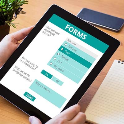
When it comes to building your form, some design choices simply work better than others. For instance, single-column forms have been seen to work more effectively than multi-column forms. This is because the single column allows information to be filled out faster.
Additionally, when you have the option to choose between radio buttons or dropdown menus, go with the radio buttons. They have been found to be comparatively much faster than dropdown menus.
User Experience
As implied above, the real key to a good form is to make it as user-friendly as possible. There are a few methods of doing so.
Limiting the amount of typing that your user needs to do to fill out the form will make it more likely for them to do so. If your fields are able to be completed by selecting from a list of options, rather than typing out their options, your user is more likely to complete the form. Enabling Autofill on your form also simplifies the process for the user.
You should also be as accepting about formatting as possible. Enabling auto-formatting features in your form fields allows your visitor to just type without worrying too much about formatting, as your fields will correct the formatting automatically. For instance, instead of entering their credit card number xxxx xxxx xxxx xxxx, or their phone number as (xxx) xxx - xxxx, allow them to just enter the number as one long stream (or xxxxxxxxxxxxxxxx, xxxxxxxxxx, respectively).
To continue to simplify the user’s experience even further, don’t make them wait until they’ve completed all form fields and tried to submit it before notifying them of a mistake or error in one of their fields. Instead, use inline field validation to alert the user of an issue in their submission in real-time, displaying the error immediately after it has been made.
Additional Considerations
There are more practices to follow to make your forms as successful as possible. First, make the final reward that your visitor will receive for filling out the form clear in the form’s title. Turn the submit button into a call-to-action that relates to the “prize” for filling out the form in the first place. “Download your Guide” is much more appealing than “Submit,” after all.
Finally, don’t hesitate to use the Thank You page that submitting the form brings your visitor to as a lead generation tool itself. By incorporating calls-to-action to explore related content on your success page, you not only keep your visitors on your website, absorbing impressions, you can also track conversion analytics.
For more help with forms, or any other of your online marketing efforts, reach out to us at 888-546-4384 or contact us here.
About the author
![]()

Blog Categories
Grab this article

Comments