JoomConnect Blog
What To Do If Your Logo Needs a Redo
If you were to show someone on the street an image of a arching yellow “M,” they would almost certainly recognize the brand that the iconic symbol represents, and could probably name many of the marketing initiatives and products that the associated business releases to the public. That’s the power a logo can hold--a single stimulus that can bring complete recognition of a brand, which is a significant tool to wield in pursuit of a successful marketing strategy. However, as a company ages, its logo may eventually need to be redesigned to better reflect the sensibilities of the company. When this becomes the case, there are particular best practices that should inform the design process to develop the most effective logo to represent the business.
Considerations to make when designing your logo
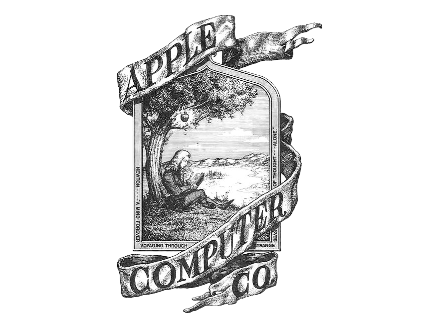 Keep It Super Simple - This was a lesson that is very well demonstrated by Apple Computers. In order to be instantly recognizable, a logo needs to be simple enough to be absorbed and appreciated all at once. Due to this, it can’t be too complicated in its design. Apple’s initial logo design demonstrates exactly why: depicting the fabled scene of Sir Isaac Newton sitting under the apple tree that mythically inspired him to develop his theory of gravity, the original logo was busy, detailed, and complex. This made the logo difficult to replicate and, more importantly, difficult to remember. Apple’s next attempt to design a logo took the opposite approach, and resulted in the original version of the bitten apple symbol that is still recognizable today.
- Make Sure You Logo Is Adaptable - As a logo is designed, it is also important to consider where and how it will appear when it’s reproduced. Will it still be recognizable if it’s printed without color? Would it still carry comparable impact in black and white as it does when it utilizes the full color spectrum? If not, it may be best to return to the drawing board and start over - perhaps creating the initial design without color and adding it in later, if including any color at all is even necessary.
- Take Advantage of Established Associations - Different colors and shapes have long been associated with numerous moods and impressions. This means that, if utilized properly, the right choice can help elicit the response you want from your audience and influence how they feel about your company. The current trend in logo design is to utilize a bold, monochrome design. With a well planned combination of shape and color, an entire philosophy could be conveyed in a single image.
- For example, shapes with well defined angles--like squares, rectangles, and triangles--tend to convey stability, balance, and reliability, with their sharp lines communicating energy and dynamic movement. On the other hand, curves and circular shapes convey a message of support and protection.
- Colors also come with their own connotations as well: white can communicate cleanliness and neutrality, while utilizing gray makes a logo seem timeless and exude practicality. Blue is often associated with loyalty and truth--hence “true-blue”--while red is frequently used to symbolize energy and intensity.
- Combining the right colors and shapes can allow you to communicate a message to potential clients on an emotional level, assisting you in creating the right impression.
The Typical Logo Design Process
Part of creating an impactful logo requires a passing knowledge of design choices and what each style will represent.
 Type-Based: These logos are those that consist of the name of the company that they represent, styled in a unique and distinctive way. Some typeface styles in logos are distinctive enough to be shortened to a single letter and still remain recognizable, such as that of a world-famous entertainment mogul that is also recognizable by a pair of mouse ears.
 Illustrative: Unsurprisingly, an illustrative logo incorporates a relevant illustration into the branding, sometimes overtly, and sometimes as a more obscure feature.
 Abstract: Also unsurprisingly, abstract logos follow an approach fairly opposite to that of illustrative--instead of visually depicting what the logo should represent, an abstract logo finds it memorability in the fact that it is detached from what it represents.
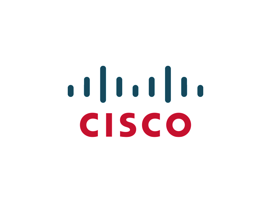 Hybrid: Naturally, a hybrid logo is a combination of two different styles of logo -- Cisco’s, as pictured, is both text-based (in the name of the company--which also is short for San Francisco, the company’s founding location) and as an illustrative logo with vertical lines that are meant to represent the Golden Gate Bridge.
Location, Location, Location
Of course, no matter how well-designed a logo is on paper, it may not look as nice in other formats. Sure, that intricate loop may look nice on a brochure, but will it cause an accident if you print it on the side of your company vehicle?
Of course, you also have to consider the publishing capabilities of whatever format you select to reproduce your logo upon. What if color reproduction isn’t available? Will your logo still recognizably represent what you want it to, or will it become just another shape? Considering the typical results of printing within a particular format will allow you to judge if your logo will remain effective if it is reproduced there.
Before You Begin, Find Out What Works
It never hurts to examine how other members of your industry represent themselves. This not only allows you to take a page out of their book to incorporate into your design if something is particularly effective, but it also gives you perspective on what doesn’t work and how to stand out from the crowd. If you can reach a balance by creating a logo that fits into the conventions of your particular industry’s typical design strategy while still standing out as its own thing, you will be able to create a unique but recognizable image to potential clients to be influenced by.
If there’s a special purpose behind your brand, or a unique selling point that you could possibly incorporate into your design, that’s just another way to create a more individualized representation of your brand. Experiment with different ideas and designs to find a good balance between familiar and unique that depicts you well, and crowdsource your decision-selecting process to make sure the majority of your company is on board with their new identity.
A Few Final Things to Remember
Designing a logo, while rewarding, can also be a lengthy and work-intensive process involving a lot of trial and error. By combining your own intuition with research into your targeted market, you can create a logo that will instill a lasting impression upon your potential clients. If you’d like any further assistance with your logo design, reach out to us here at JoomConnect--we can advise you on other best practices, or provide a logo exclusively for your use. Check out http://jmct.io/letstalk for more assistance with representing yourself with a new logo, or with any other marketing task you’ve encountered.
About the author
![]()

Blog Categories
Grab this article
